Carbon five Team:
1 Design Lead
1 Designer 👋
1 Product Manager
2 Developers
Client Team:
1 Product Manager
1 Brand Manager
1 Content Strategist
1 UX Researcher
1 VP of Design
Autodesk Design Home
UX + visual + content design for an internal platform to help connect the Autodesk design community.
Project Brief
The Autodesk Design Home was a part of a series of special projects being spearheaded by Maria Giudice, the VP of Design at Autodesk. The company has a global design team spread across many offices, but at the time they did not have a good way of sharing best practices or institutional knowledge. The goal of the design home was to help unify the larger design team, largely by helping individuals find each other for learning, knowledge transfer (around projects, practices and tools) and finding mentorship within Autodesk.
The site was built on top of WordPress because of the accelerated timeline - with the intent that it would be migrated to another platform if it were successful. We launched successfully, on time, and the platform is still in use today.
Project Duration
3 months
RESEARCH SYNTHESIS
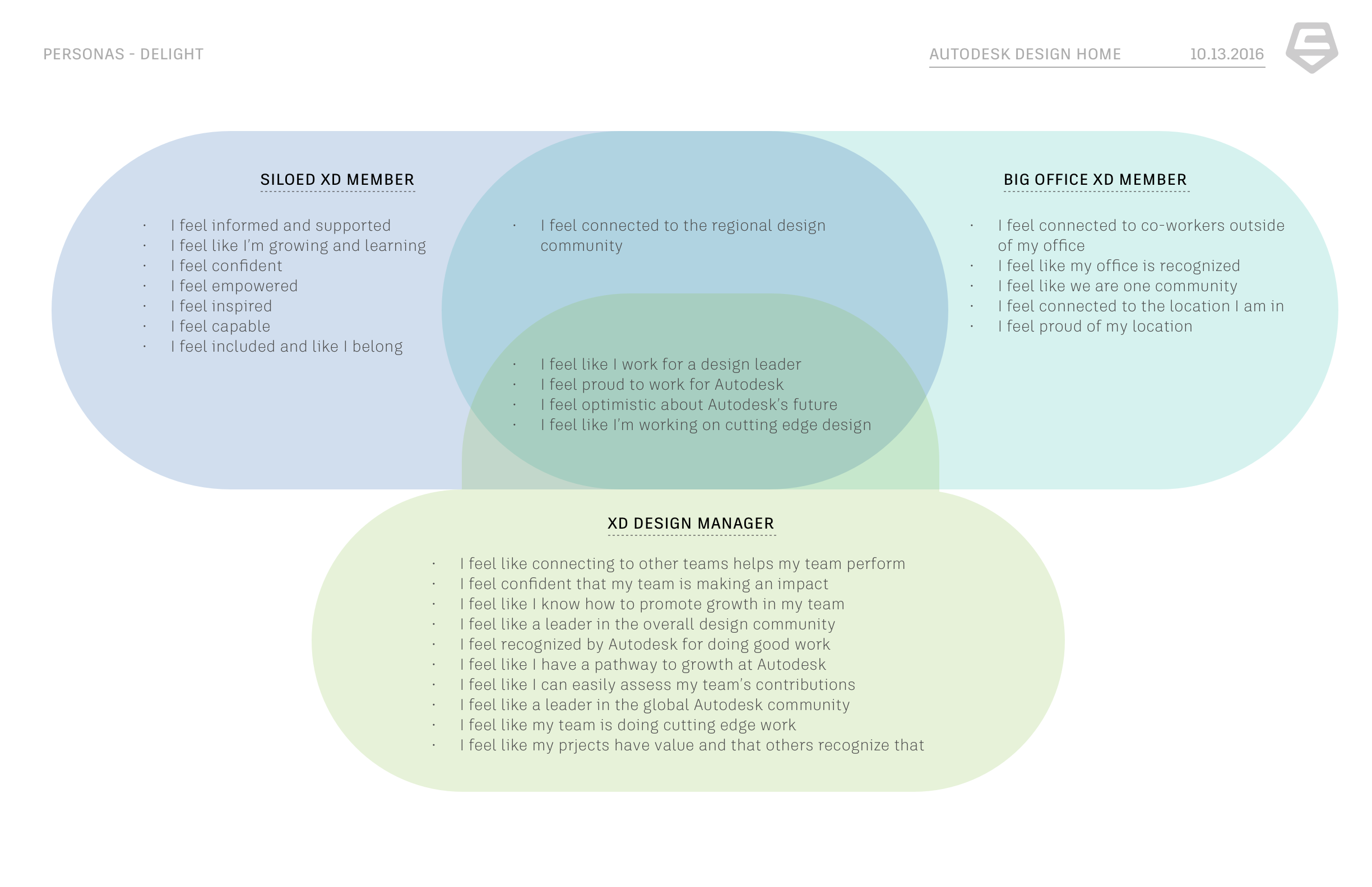
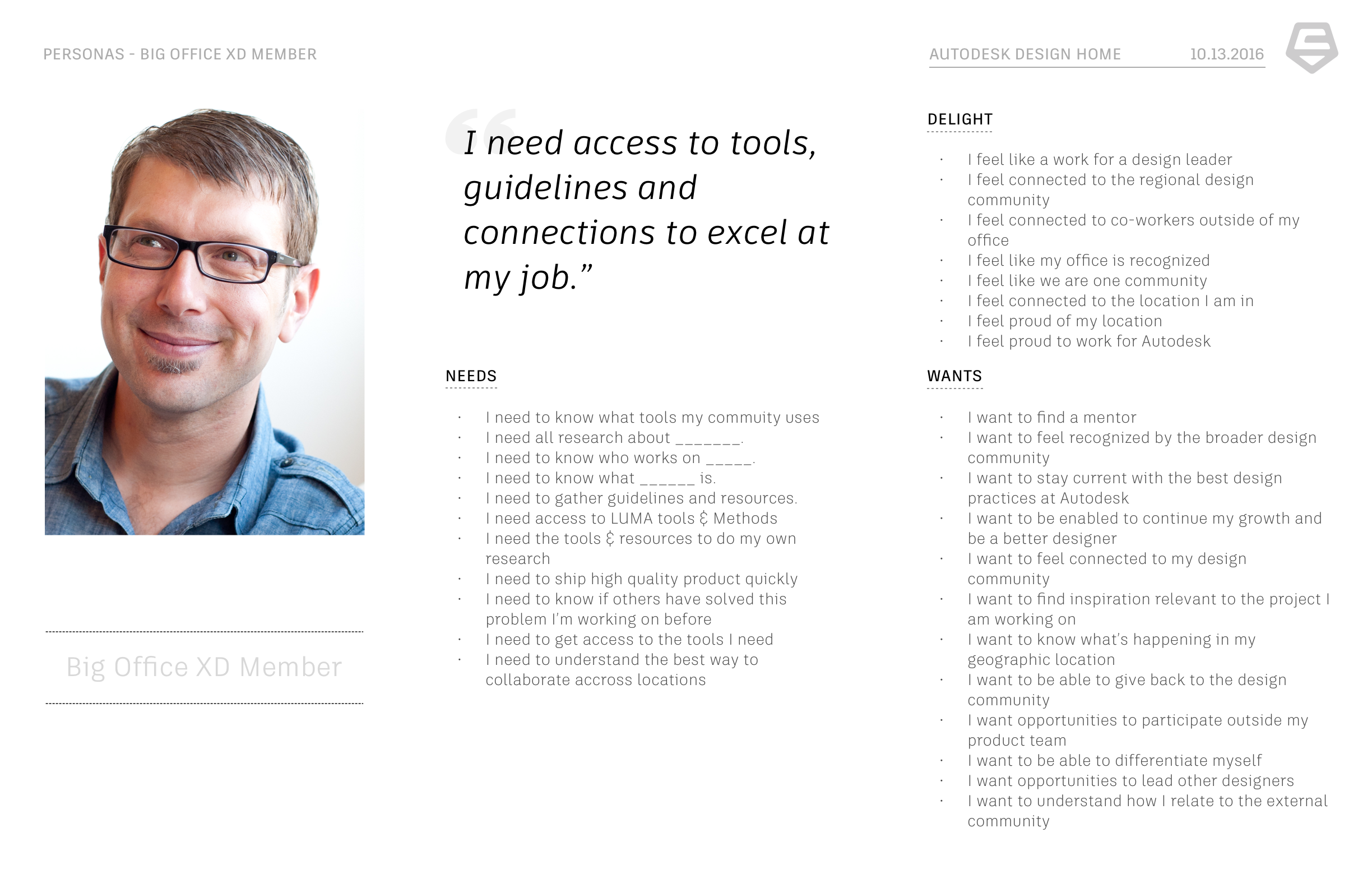
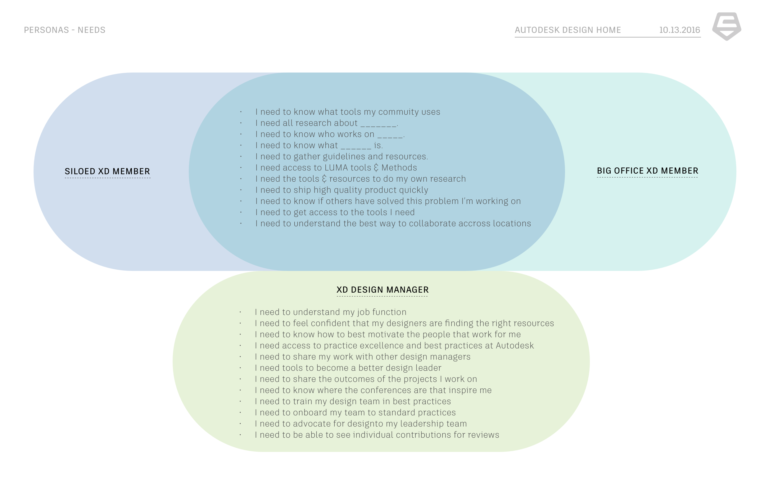
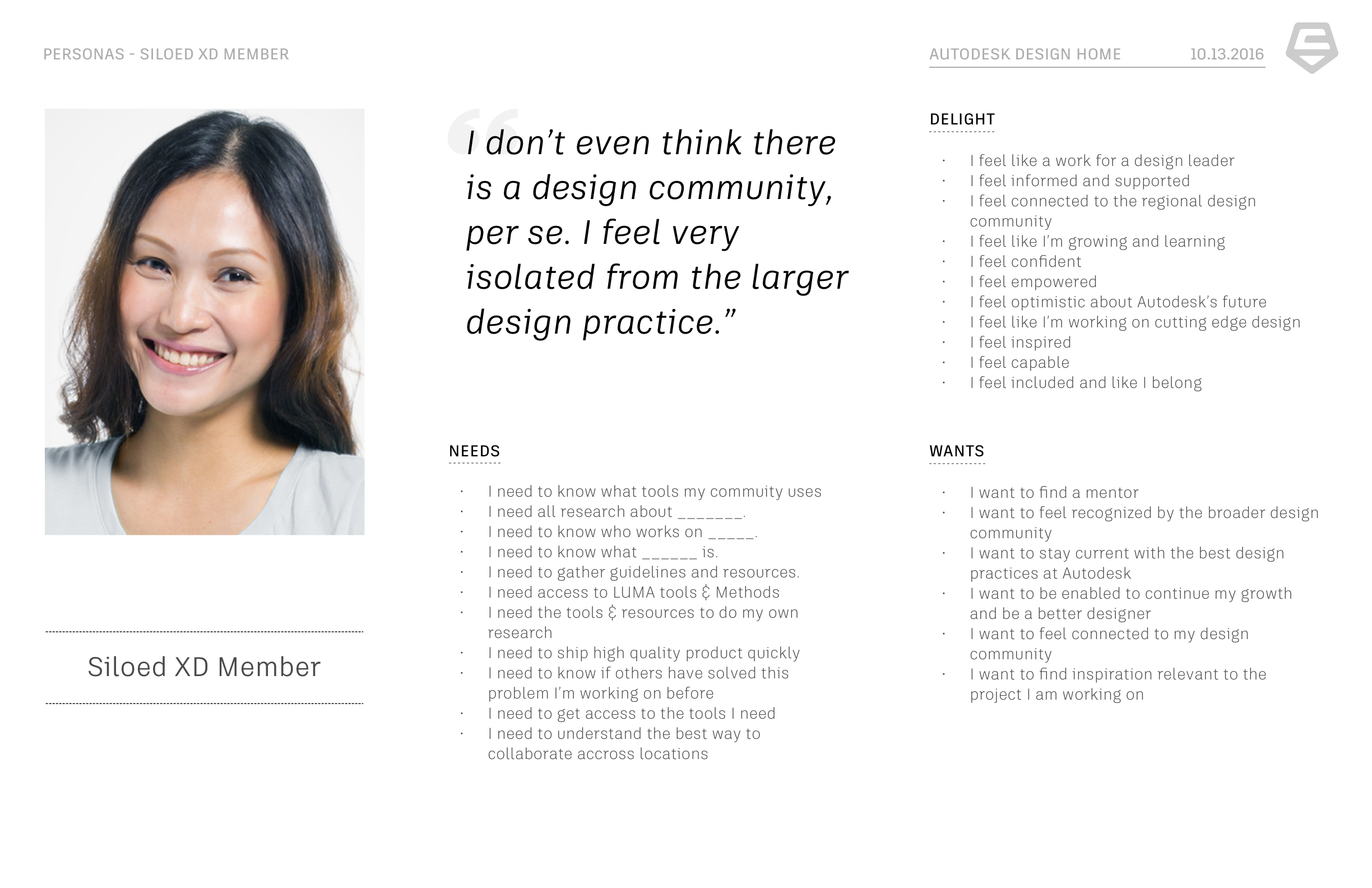
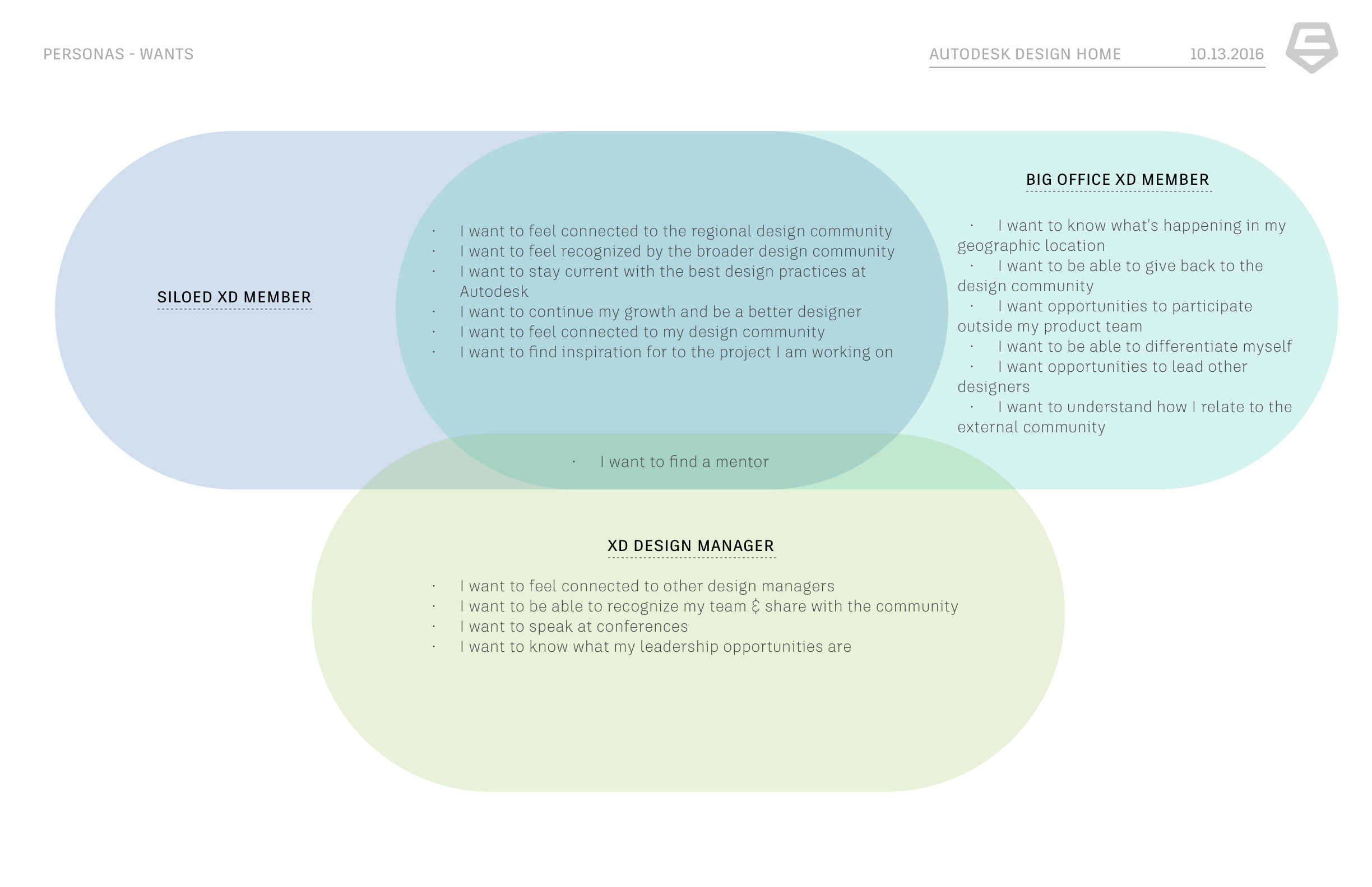
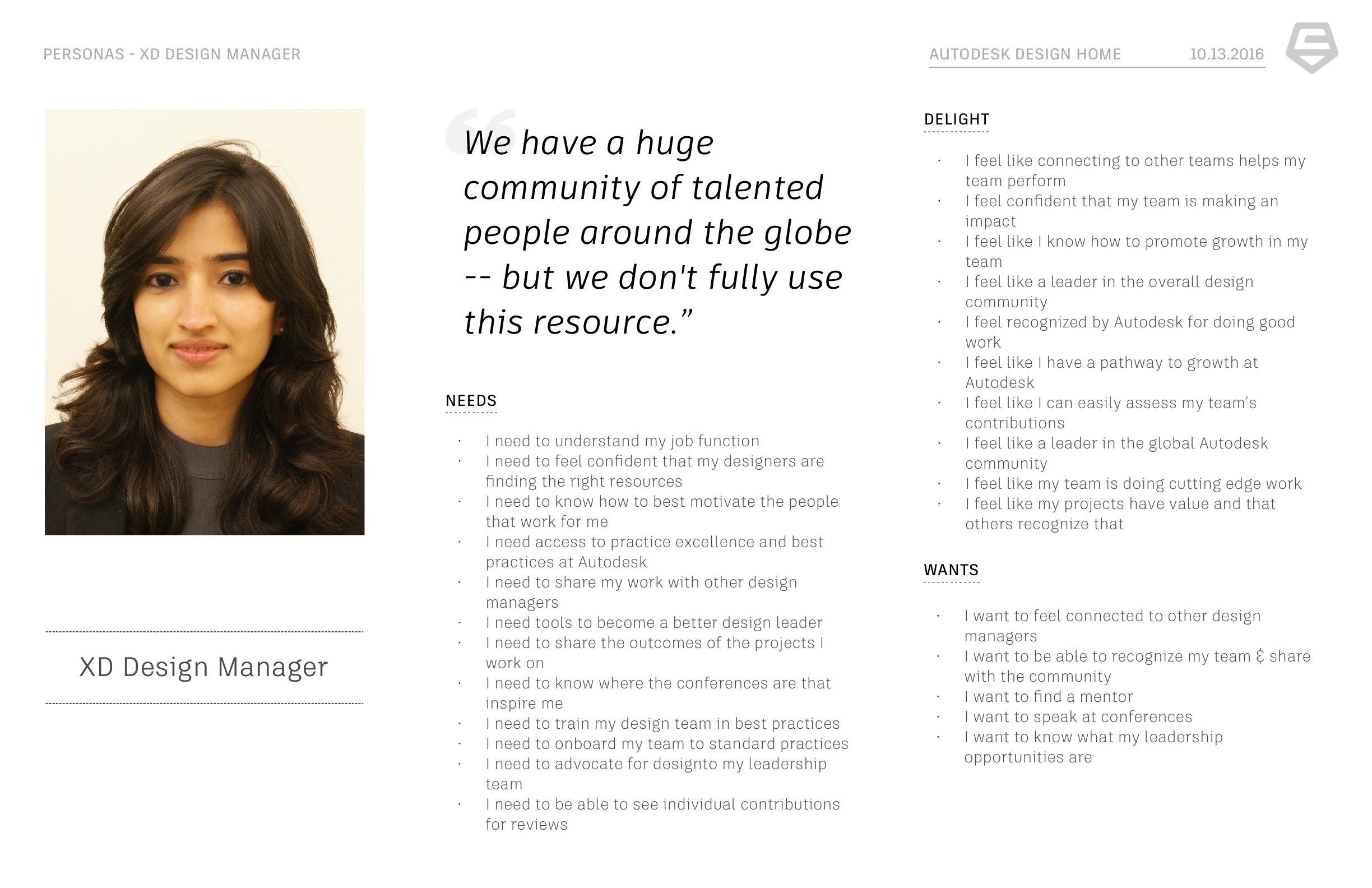
Autodesk came to us with a few different user archetypes that we expanded on by creating proto-personas to better understand the pain points of being a designer in a large corporation. We did this by synthesizing research that one of the researchers at Autodesk provided as well as by running a persona activity during kickoff.
Site map and flows
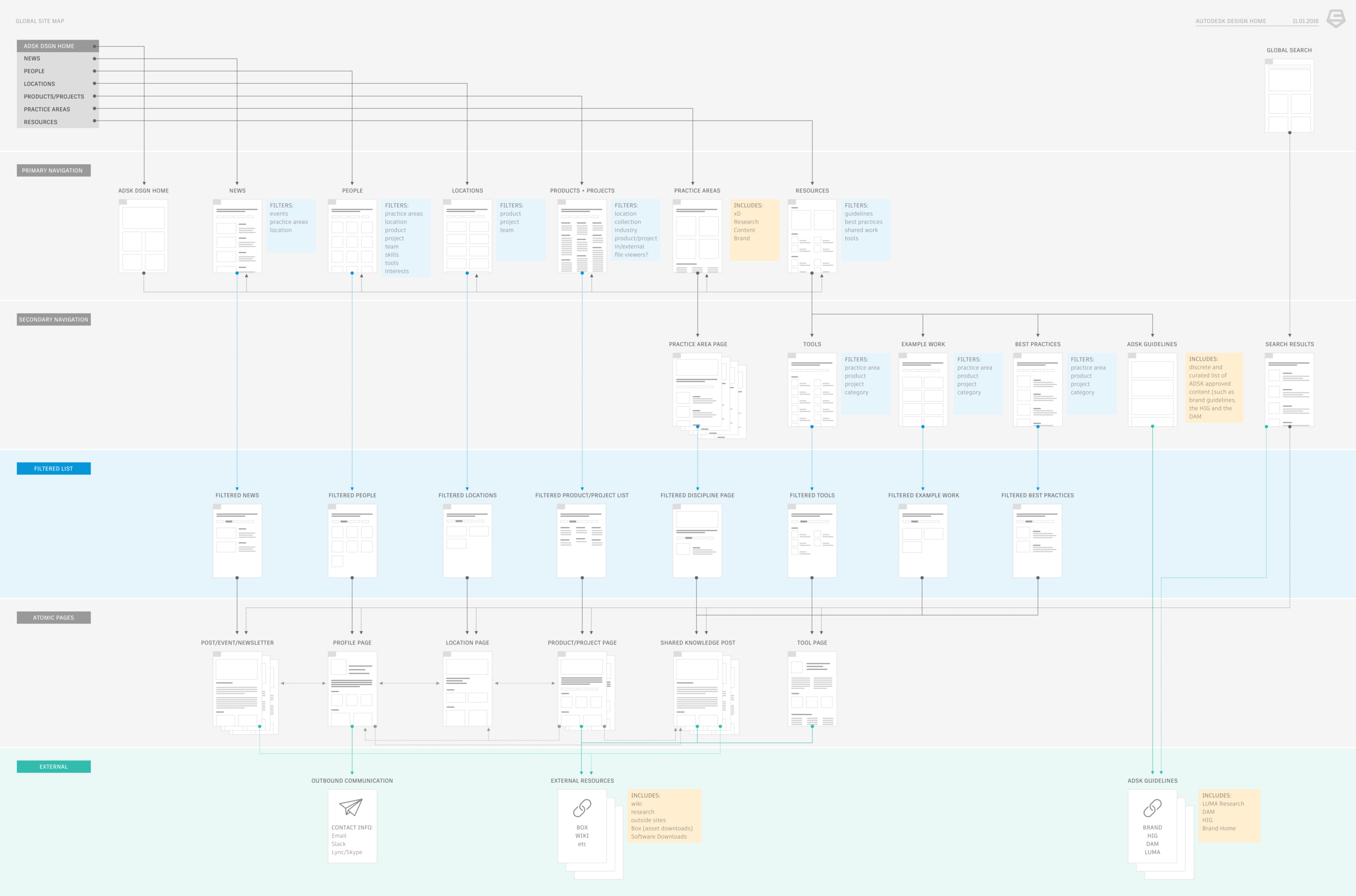
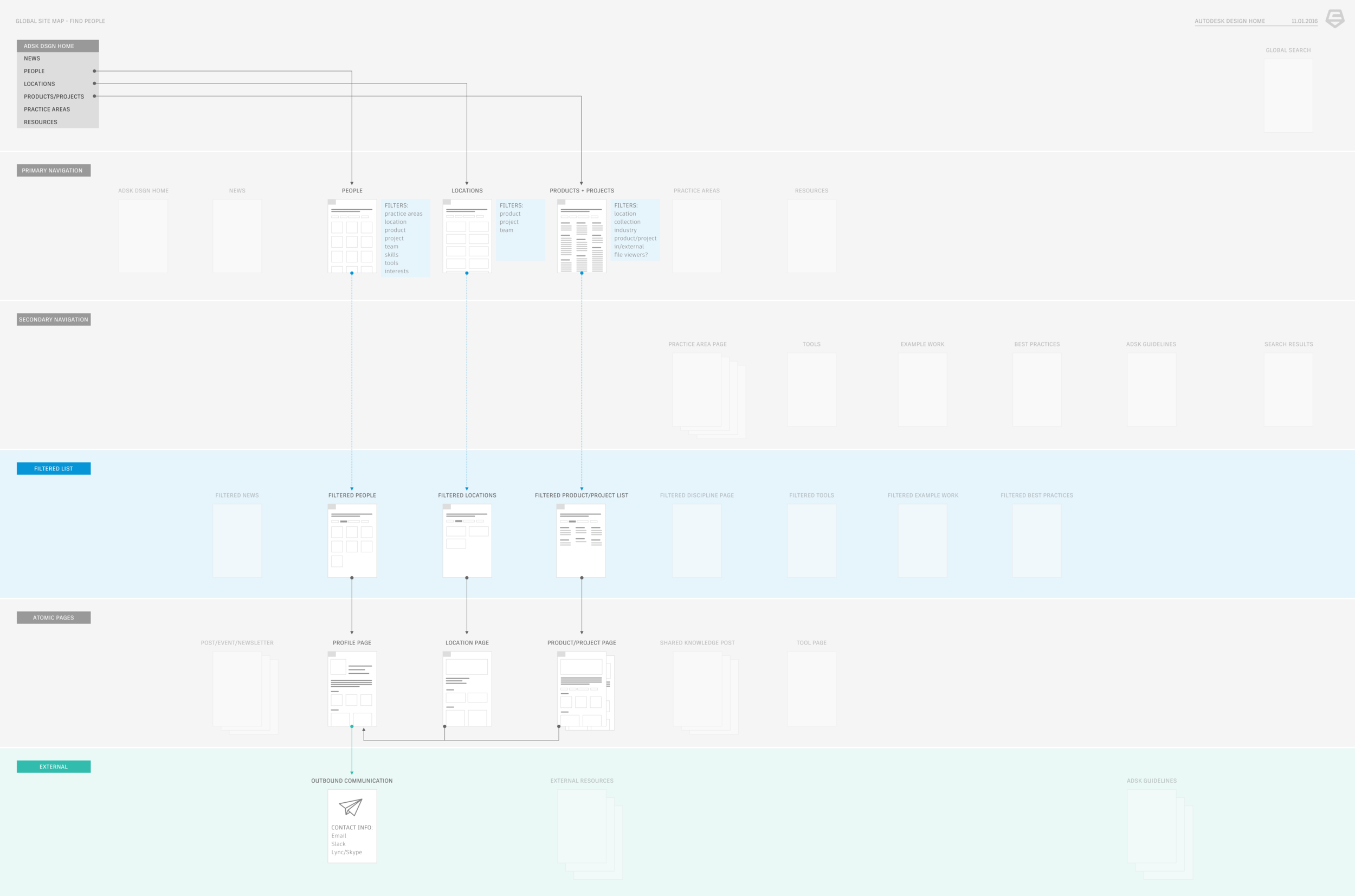
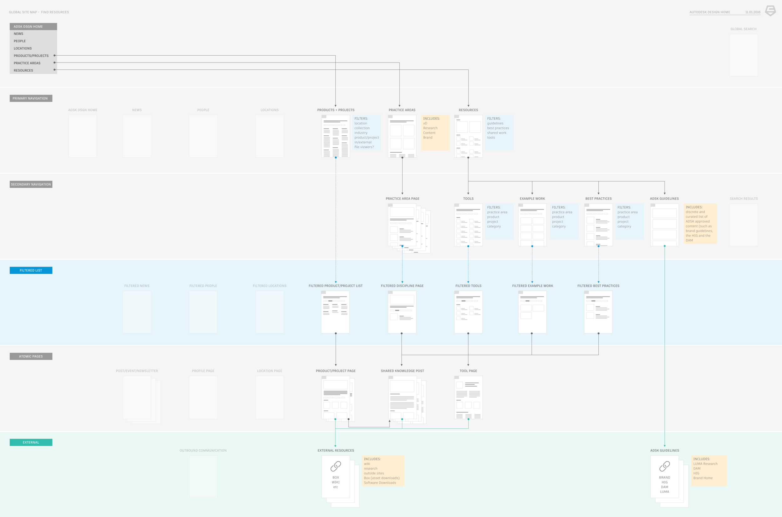
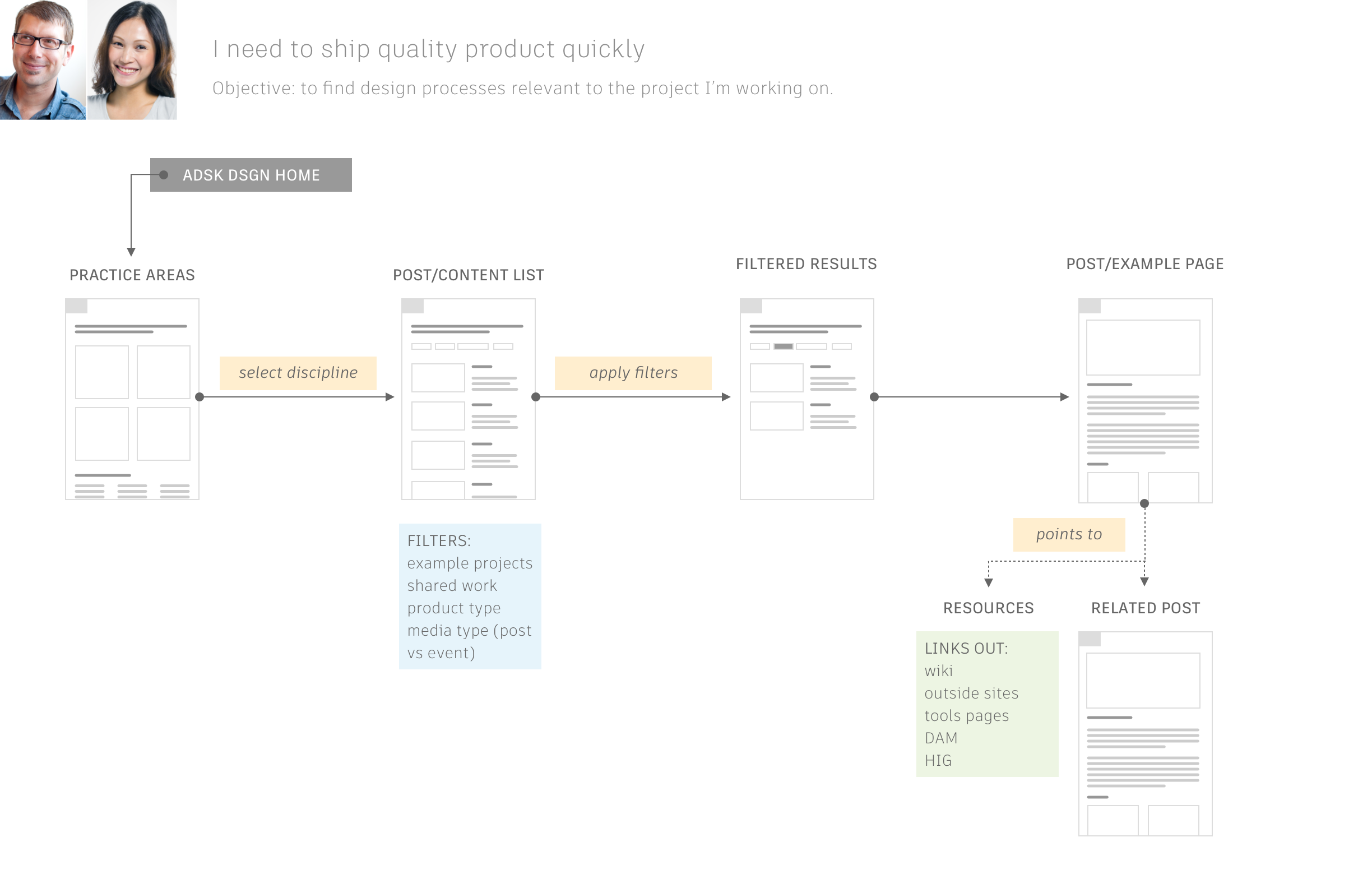
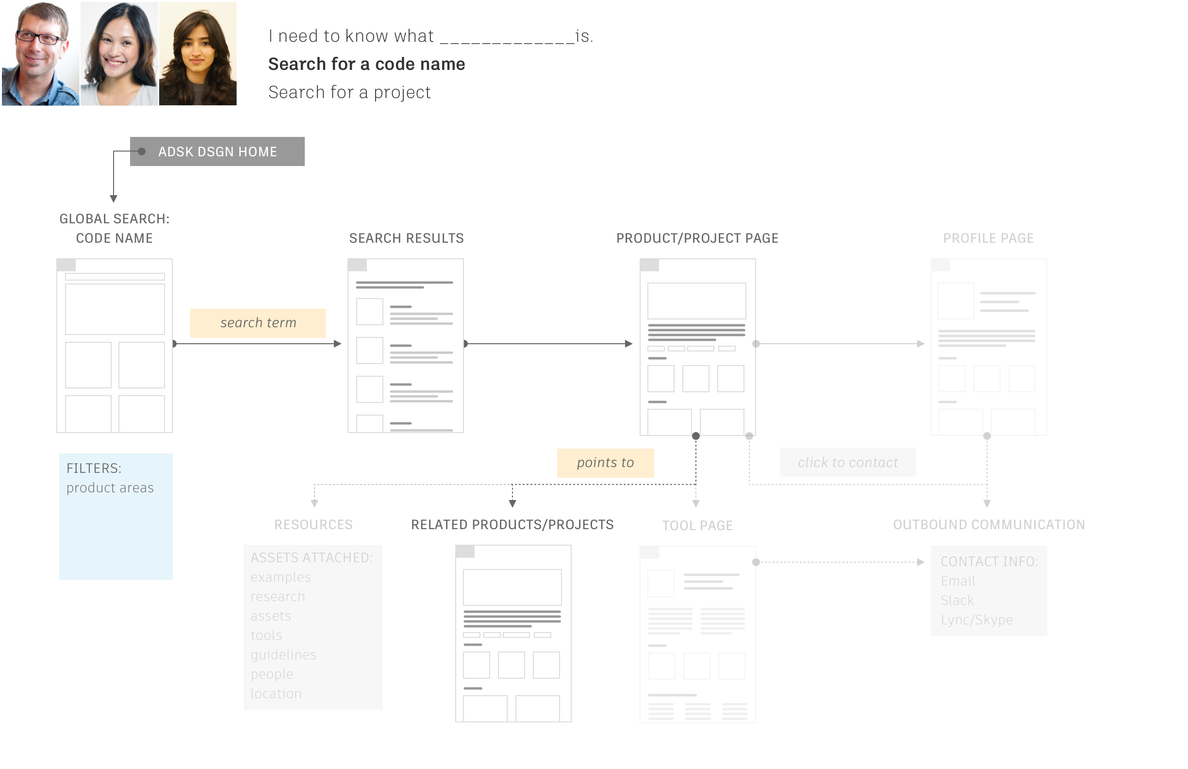
In thinking through the navigation and site structure I mapped out the index and detail pages in a site map to identify the different page types to design. I also used this map examine flows to different pages on the site and to look at how our personas might try to find different pages.
WIREFRAMES
Often on projects, because engineering often starts with design at Carbon five, we will go straight from whiteboards into high-fidelity mock-ups.
However, on this project, because we had the luxury of design lead time, we slowed ourselves down a bit and created wireframes for each page before moving on to high fidelity drawings.
from left to right: news page, people index page, location index page
Bringing it all together
Here are some sample screens that we ended the project on for the product launch at Autodesk's internal design conference.
We were tasked with adopting the Autodesk Brand Guidelines that had just been published online. Part of our review process was making sure that we met brand requirements as well as content requirements. This meant using approved fonts, imagery and iconography.
My work included the plan for the overall site structure, the homepage, detail pages, index pages (people, locations etc), discipline areas, and posts.
from left to right: practice area page, news feed, people index page, filters, profile page
The user profile page allows designers at Autodesk to learn more about their coworkers (especially to find out if they had institutional knowledge that could be shared).
The news page synthesized announcements and posts published internally at Autodesk design.
The location pages allows employees to find each other via location. If someone is searching for a specific project or team they can also find more information about where those teams and projects are located.
The home page acts as a summary page to funnel users into the practice area pages, to highlight important events and announcements, and to highlight individuals in the community.
Each practice area has a dedicated page that aggregates all content types associated with that discipline (news, projects, articles, individual profiles, etc…)


